Brand kit
The edad.tech logo was designed with graphic elements that reflect the essence of the institution and represent its identity. This allows us to be recognized both nationally and internationally.
Below, you will find versions of the logo (in PNG and SVG formats) available for download and use in print or digital media, as well as in institutional publications.
Color versions
Standard logo
Alternative logo
The edad.tech logo has two color variations.
Whenever possible and provided it doesn’t affect the logo’s legibility, the color versions should be used.
Monochrome versions
Positive logo
Negative logo
In visual pieces where it is not possible to use colors or where a classic black and white aesthetic is desired, it is recommended to use these monochrome versions.
Cutaway version
Cutaway logo
Only for visual compositions where it is necessary to use the logo on a background and highlight the negative space.
Clear space
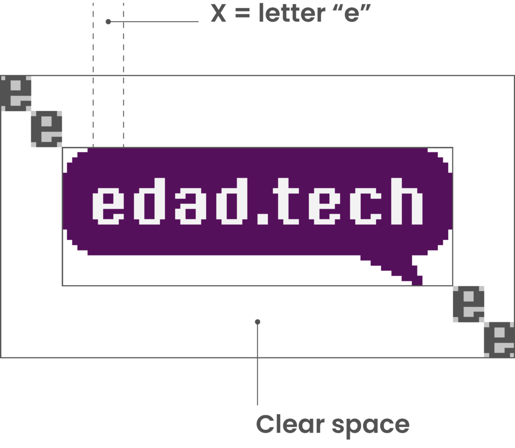
Proportions and “X” height
The clear space of our logo is created by doubling the letter “e” that is part of the logo. This dimension is applied in the same way to all edges of the logo and should not be occupied by other graphic elements.